 |
UI Accessibility Plugin
Version 1.1.1
Make your UI accessible for visually impaired users
|
|
UI Accessibility Plugin
Version 1.1.1
Make your UI accessible for visually impaired users
|
UAP supports the following UI elements: Labels, Buttons, Toggles (2 variations), Sliders, Text Edit Fields and Dropdown Lists.
It also supports interactive and non-interactive 3D objects in the world (3D label and 3D button).
Most of these elements come with their own set of Settings, which will be discussed here.
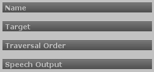
There are a number of settings that are common to all UI elements, regardless of their individual type.
|
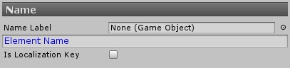
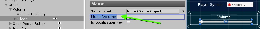
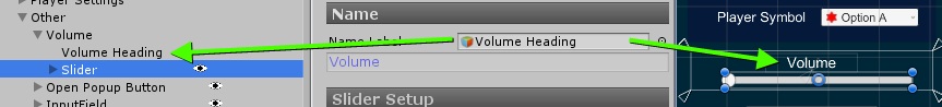
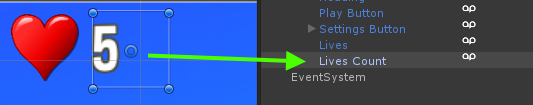
The name of a UI element is the first thing that the plugin will read when the element receives focus.
For labels, this will be the text inside the label. For a button, this would be the text on the button. Etc.
|
You can provide a name manually, or point the component to a label in the scene that contains the element's name or description.
| Option 1: You can manually provide a name for the element. |
|
| Option 2: You can point to a text label in the scene. |
|
NOTE: Prefix has been renamed to Combine String. Apart from the name, these instruction remain the same.
You can have the plugin automatically read out a combination of your own text and the text of a label by setting a prefix text. This is only available if you are using a text label, obviously.
This option is especially useful for virtual currencies, statistics and timers, as these are usually displayed with a graphic icon and a number. The number is usually set from the game's code.
Blind users need some form of context to understand what value the number represents.
Here's an example of how to use a prefix to build a composite name:
|
|
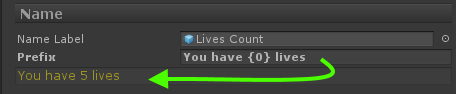
UAP can automatically combine multiple labels into one accessible label. This reduces the amount of times the user has to swipe to get the same information as sighted user can see in one single look. This is useful if your UI layout requires using multiple labels, but the information all belongs together.
In the example below, all stats of an item could be combined into one accessible label, allowing the user to swipe from one item to the next quickly (instead of having to traverse each stat individually to get to the next):
|
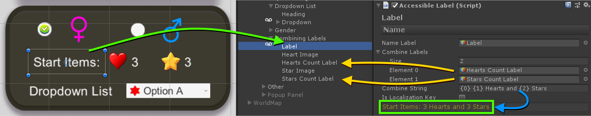
The UI Navigation sample scene contains an example for an accessible label that combines the information of multiple UI labels into one.
|
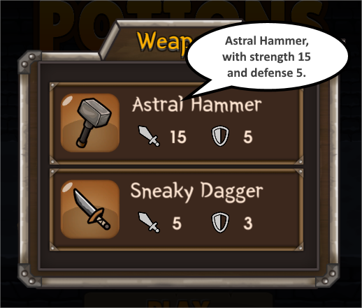
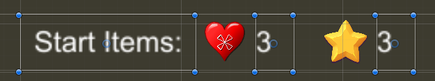
When navigating, the "Start Items" section of the UI will read out all information in one go/
"Start Items: 3 hearts and 3 stars"
This information is filled in from a total of three UI labels in the scene:
|
Only the first label has an Accessible Label component attached to it.
In the "Combine Labels" section, the other two labels (the ones containing the amount of hears and stars) are merely referenced.
The Combination string references the labels using placeholders like this: {0}, {1}, {2}, etc
In this example, the combination string
"{0} {1} hearts and {2} stars"
is automatically filled and becomes
"Start Items: 3 hearts and 3 stars"
|
Combination labels also support localization.
You will need to include the placeholders {0} etc in your translated texts.
The plugin will translate your provided key and fill in the placeholders with the text from the referenced labels.
|
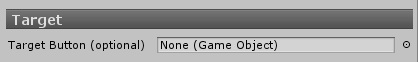
The Accessible UI component does not need to be placed on the same GameObject as the UI element it is supposed to make accessible.
This setting is optional.
|
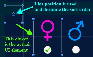
This can be useful to ensure a certain traversal order, because the order is determined from the positions of the GameObject that holds the Accessible component.
You can place the Accessible UI component on a different object in you scene and point to the target UI element here.
|
The UI highlighting frame will always be shown around the actual target object, not around the object holding the Accessibility component.
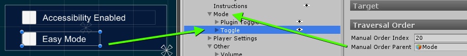
You can manually set the order in which elements are traversed for individual UI elements.
You can however only change their position order inside their respective UI Group Root. The order of UI Groups is not influenced by the settings in this section.
|
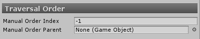
To manually specify the order in which a number of UI elements are traversed, you need to specify a sort order and a parent object. You need to supply both, or the setting will be ignored.
Order Index: This is the order (ascending) in which the elements are traversed. You can leave gaps in the numbering, to allow for easier changes later, for example 10, 20, 30, and so on.
Order Parent: This is an object in your UI that serves as a base for the position calculation. You might choose to only manually specify the order of some of your UI elements. The system uses the position of this parent object to determine where to place all of the manually sorted UI elements in relation to the rest of the UI elements. This does not need to be an actual parent of any of the UI elements that are manually ordered.
|
This section contains settings that apply only when this element receives focus.
|
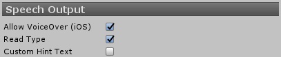
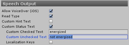
Allow VoiceOver
On iOS you can prevent this element from being read aloud with VoiceOver and read it with the regular speech synthesizer instead.
In general this setting should be left at its default state of on, because it allows your users to navigate your app using their chosen voice and speech rate.
Disabling this setting could be useful if you need a strict distinction between your regular speech output and this specific element. This could be the case for special notifications and popup windows.
Read Type
Got all interactive elements, such as buttons, the plugin will read the element type after a short delay after announcing the element name.
Example: "Play" (Pause) "Button" (Pause) "Double tap to select"
In some special circumstances you might want to prevent the type from being read, for example in puzzle grids, when each grid tile is a button and the constant repetition isn't necessary, but instead annoying and immersion breaking.
Custom Hint Text
The automatic hint text is picked automatically by the element type and platform.
Under certain circumstances you might want to provide a custom hint text here. This can be useful if you want to give more information on what you control does.
Example: "Activate to reset all tutorials in the game"
You shouldn't rely on users listening to this text however, as often times blind users only listen to the name of a control and then move on.
|
|
The Accessible Plugin Toggle is a specialized version of a regular toggle designed specifically to be placed on a toggle in the application's settings screen that controls the accessibility mode. Using this you will not need any additional code to handle this toggle.
This type of toggle cannot be used anywhere else.

|
This helpful script initializes the associated UI toggle with the correct state. Depending on whether or not the plugin is active, this toggle will be set or unset.
This is especially helpful because the plugin might be turned on from a number of sources (VoiceOver/TalkBack was detected, the plugin was active during the last session or the user used the magic gesture to turn accessibility on.).
The plugin might also activate/deactivate while the UI toggle is visible on screen (via a gesture for example). This component will ensure that the toggle state is always correctly updated.
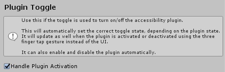
|
The toggle can also activate/deactivate the plugin when the toggle is flipped in the UI.
This behavior is optional (but enabled by default). You can turn it off if you want to show your users an additional confirmation dialog before enabling accessibility (and drastically changing the controls).
In this case you need to call UAP_AccessibilityManager::EnableAccessibility() from your code.
 1.8.11