 |
UI Accessibility Plugin
Version 1.1.1
Make your UI accessible for visually impaired users
|
|
UI Accessibility Plugin
Version 1.1.1
Make your UI accessible for visually impaired users
|
This page will cover how the plugin works in more detail.
If you just need a quick jump start, check out the Quick Start Guide.
The plugin works by attaching an accessibility component to all relevant UI elements in the scene.
These components allow the Accessibility Manager to keep track of every component active on the screen. The plugin can then handle navigation between the corresponding UI elements using Swipes (on mobile) or keys (on desktop). It will read out names, types and hints and forward interaction events to the UI elements.
Any UI element that has no accessibility component is invisible to the plugin (and to the blind user).
To make sure that the user doesn't accidentally press any buttons or other UI elements, the Accessibility Manager puts a full screen panel over everything, to catch clicks and touches.
This panel is transparent, it won't interferes with your graphics. You can change the color of the panel and make it opaque, if you want.
The panel needs to lay on top of everything else. To ensure that, the Canvas it is on has been given a Sort Order of 1000. If your app uses higher sort orders than that, please adjust that number upwards so that it is the highest in your entire app. For NGUI the touch blocker panel is created dynamically and added to the UI root in the scene after level load. It's depth is set to 11000.
The panel will not block any input if the Accessibility Manager is disabled, paused or set to not handle UI inputs.
The plugin supports Labels, Buttons, Sliders, Toggles, Dropdowns and Text Edit Fields.
There is also a special toggle version of the called Plugin Toggle, which can be used in the game settings to enable/disable accessibility without having to write any additional code.
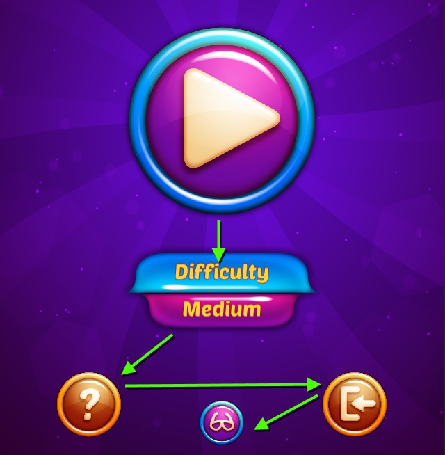
Please take a look at the demo Navigation Scene to find examples of the most common UI elements and use cases.
The various Settings of each component are explained in detail on this page: UI Elements
Each accessible UI element has a name, a value, a type and a hint. These are all read out by the accessibility plugin when the element is selected. The information is ordered by importance - so that the user can quickly abort and move on. Rarely will blind users wait for everything to be spoken.
Example:

|
Note that not all UI elements have a value - only Sliders, Dropdowns and Toggle Buttons do.
When an interactive UI element is set to inactive, but is still visible, the plugin will move the focus cursor onto the element normally, but read out that it is disabled. It will not allow interaction with the object.
|
Any UI element that is completely hidden will be skipped by the plugin and treated as if it isn't there.
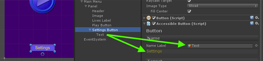
Generally, all you need to do is give the element a name. The plugin will take care of value, type and hint.
By default, when an accessibility component is added to a UI element like a label or button, it will try to read the label directly. For all other UI elements, or when no Label could be found, the component will use the name of the GameObject as a name.
You can also provide a name manually, or point to a label that should be read instead.
|
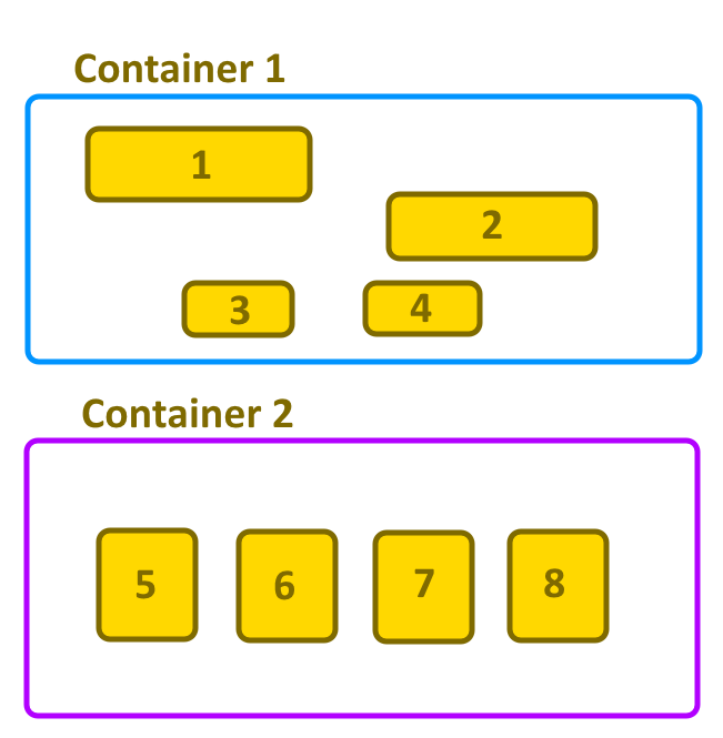
All accessible UI elements on a screen are grouped together under an Accessible UI Root. 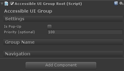
Elements inside a group are ordered by their position, from left to right and top to bottom. You do not have to use more than one UI Group Root per screen - it is completely optional. |
|
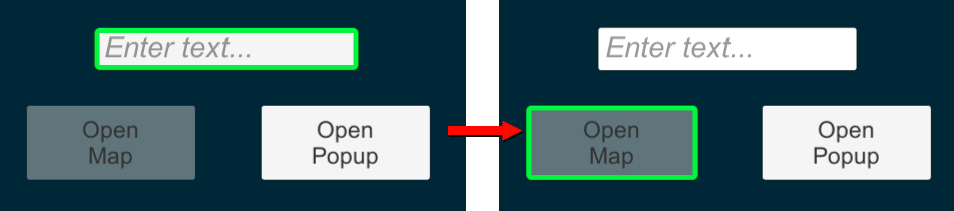
Speed Up Navigation By GroupingYou can use UI Group Roots to sensibly group UI elements together. This can tremendously speed up navigation. Example: If the level buttons and the back button were in two separate UI Groups, one single swipe down will have the user jump directly to the Back button. |
|
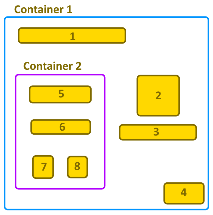
It is important to understand that all elements within one container will be navigated through before the next container is entered. This is relevant because groups can overlap one another visually on screen, and groups can contain other groups further down in the scene hierarchy. Accessibility elements will always belong to the first UI Group Root they find upwards from their own position in the hierarchy. The example setup one to the right demonstrates the navigation rather well. |
|
Different from UI elements, UI Groups are not ordered by position.
UI Groups will be traversed in the order that they (and the GameObjects they are placed on) are created.
This is usually equivalent to their order in the hierarchy.
|
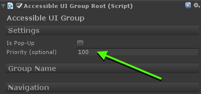
You can overrule this by setting a manual traversal order, using the Priority property of the UI Group Root component. The UI Groups are then traversed in order of priority, from highest to lowest.
When setting this up, it's advisable to use large numbers and leave room between the groups, so that you have wiggle room to easily add in more groups later.
For example 10, 20, 30... instead of 1, 2, 3... will allow you more flexibility later.
 1.8.11